Thursday, November 17, 2016

A Delight-Four Birthday Layout - Week #43

It's Nancy, back again with another fun and easy scrapbook layout! Today I decided to catch up on some old - really old - photos and go all the way back to my daughter's 4th birthday. (Did I mention that my daughter is now a teenager?)
As always, I was able to make this layout in just a few minutes using the layout patterns in the [affiliate link] Scrap Free Scrapbooking eBook by Jennifer Priest. This layout was made using half of a two page design from cutting pattern 3. 


I made some modifications to the pattern to accommodate the photos that I wanted to work with. I printed all of the photos 4" tall to start with, and then trimmed some of the edges so that they fit better across the page. The area occupied by the picture on the right of the layout is open in the cutting pattern but I had another picture that I wanted to use so I filled it with the picture. The other two pictures occupy an area that is supposed to be a single 4" x 6" photo, but I used two photos that are slightly larger than that when put together instead. 

Layering pale colored papers on top of each other, it's hard to get definition and visual separation. To fix this, I used one of my favorite scrapbooking "cheats". I used my Colorbox Pewter Mixed Media ink (I also recommend using a gray Colorbox Fluid Chalk for this technique). I brushed it very lightly along the edges of the paper layers. The color is not obvious to the naked eye, but as you can see below it provides a subtle faux drop shadow that gives the layers more separation. 

I also wanted to get my daughter's age into the title, so I added one of the labels from the "Joy Parade" tags & labels set, and stamped the number on it. This created the pun "delight-four" as my title when I combined it with the puffy word sticker. 
For my journaling, I chose to use a horizontal journaling card. The "It's Your Birthday" heading on it helps establish the birthday theme, and the lined card means I can handwrite without it becoming too big of a disaster. 
All of the patterned paper and embellishments on this layout are from the brand new "Joy Parade" line by Fancy Pants Designs. It's exactly the sort of collection that I love to have in my stash. With designs like balloons, sprinkles, and bright pastels...this collection can create so many themes. When you have versatile things like this in your stash, it makes it so much easier to put together a layout! 

Supplies Used: 
  • Fancy Pants Designs "Joy Parade" patterned paper & embellishments
  • Hero Arts "Essential Uppercase" alphabet stamps
  • Colorbox Fluid Chalk in Blackbird
  • Colorbox Mix'd Media Inkx in Pewter


Tuesday, November 1, 2016

How to Easily Create Custom Scrapbook Paper with Hand Lettering- Week #42


There are times when you are looking for that perfect piece of scrapbook paper and you just can't find it. Making your own patterned paper is an easy solution. You can easily create custom scrapbook paper with hand lettering to fit any occasion. All you need is some cardstock and the perfect pen.


After Deciding on the Right Words or Phrases, Gather a Few Pens and Markers, Then Practice on a Scrap Sheet of Paper.

You can choose a single word, a set of words, a sentence, a quote...anything that would create text to support the theme of your page's story. My scrapbook layout is about my son's 16th birthday. I experimented with a few words and phrases before settling on one that I wanted to use. Try a few different pens with different nibs. You can also experiment with a few different colors to see if more than one color is right for the page. I chose a chisel tip style nib to get the look of hand lettered calligraphy.


*Tip* It helps to start with a color palette in mind when choosing your pen and scrapbook supplies. I used this fabulous color palette from the ClearSnap Color Challenge for October 2016.


Use a Ruler and a Pencil to Draw Guidelines on the Cardstock.

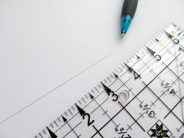
Though any pencil will do, I prefer a mechanical pencil. The lead is very thin and if I don't press hard, it's easy to erase the lines later. Any pencil will work, but it is key to NOT press down hard. The lines should be faint. I chose to write my text on an angle, but you could also write it straight across the page as well. You can also choose to start with a shape and to create hand lettered text using the shape as a guide.


Begin Writing Your Hand Lettered Phrase. Make Sure Some Portions of the Text are Written Off the Edge of the Page.

You want your patterned paper to have an organic feel. The best way to do that is to write your text off the page.  I chose to write the phrase " my son at sixteen". Note how in the line of text above that initial phrase, I began with the word at and then began writing the phrase again. If you look at the finished layout below, you will notice that I repeated this throughout the design, starting my hand lettering at various points within the phrase to add visual interest.

It's also not necessary to hand letter the entire piece of cardstock. Use a scrap sheet or only hand letter the portion of the cardstock you want to use. You can then cut it down and use it within the scrapbook page just as you would any other piece of patterned paper.


Erase the Pencil Guidelines.

Carefully erase the pencil marks. As you can see above, the white eraser helps make those lines virtually non existent. Only lines where I pressed down too hard are slightly visible.

Now you have a custom scrapbook paper with hand lettering and you can create your scrapbook page. I really love using hand lettering this way. Not only does it help you create the perfect paper for your scrapbook story, it also adds a very personal touch to the page in much the same way as handwritten journaling.

If you create your own custom scrapbook paper with hand lettering, we would love to see. Leave a link to your page in the comments section.


Supplies Used
Adhesive-:Xyron
Ink:Clearsnap
Letters: American Crafts
Die Cuts: Project Life- Lucky Charms Collection
Clearsnap Design Adhesives
DecoFoil from ICraft
Pens: Zig Journal and Title in Rose and Black
White Eraser
Mechanical Pencil
Ruler


This scrapbook layout is based on a design from the Scrap Free Scrapbooking Ebook by Jennifer Priest. I had the opportunity to test the book when Jennifer first wrote it. It was so awesome, that I became an affiliate! You can get your copy here.


Tuesday, October 25, 2016

KISS - Keep It Super Simple Pocket Page

Hello everyone!!  Kymona here to show you how to create a KISS Pocket Page. What is KISS you ask? It stands for Keep It Super Simple.  I'm going to show you how to create a pocket page that is super simple with little supplies.

Lets get started!

Here's a list of my supplies:
  • Patten paper
  • Photos
  • Stickers
  • Page Protector
  • Fuse Tool
  • Photo Editing Tool
  • Printer
  • Stamp Set
  • Sequin
The theme this month is Lettering.  This theme made me happy because I'm working on my lettering as we speak.  

I wanted to keep this pocket page really simple so that my photo were the focus of this page. 


I printed out my photos on sticker paper.  That why I could adhere them to the pattern paper.

For the middle pocket, I stamped the letter "abc" using a brush letter sentiment to go along with the theme.

I have a love for sequin so I had to add those to the open pockets.

Take a closer look:

Close up of the  middle card stamped with brush letter stamps

Close up of my actually letter.

I love how easy it was to create this pocket page.  

So what do you think? Would you give this style of scrapbooking a try?  I would love to hear from you.

Thanks for stopping by!

~Kymona


Tuesday, October 18, 2016

How to Create Beautiful Lettering with Hand Problems - Week #39

Hi! It's Nancy back again to kick off a new month at Layout-A-Week!

This month, we'll be taking on the recent trend of hand lettering, an assignment which posed a special challenge for me. After several decades of battling lupus, I have a tremor and some weakness in my grip in my hands. This doesn't interfere with my preferred forms of crafting on a day-to-day basis but can hamper my ability to do certain things - like the detailed pen work required for hand lettering.

So what's a girl to do when she wants to make fun doodling like this on a layout? 

Cricut Explore Machine Pen Doodle by JGoode Designs

The answer for me is to pull out my Cricut Explore machine, and let the machine's steady "hand" do what mine can't - draw from beautiful doodle files designed by talented designers like my friend Jen Goode of JGoodeDesigns. 


Here's the beautiful result, a layout that makes me look like a doodling master (shh, don't tell!):

Cricut Explore pen doodling scrapbook layout
This layout was created using the fabulous [affiliate link] Scrap Free Scrapbooking eBook by Jennifer Priest, which contains sets of layout patterns that allow you to quickly design multiple layouts from only a few sheets of paper. The system is fast and affordable! This layout is based on one of the layouts in cutting pattern #2. 


To begin this layout, I printed out my photos in the sizes I thought would work. The large photos I printed out in their native aspect ration from the iPhone. It doesn't quite fill a 4x6 photo, leaving a bit of space on each end, which was perfect for the size that I had available on the layout. I slightly trimmed the top and bottoms of these photos before sticking them down, as well. 

The small vertical photo is printed at 3" x 4", which has become more of a standard size since the advent of Project Life in recent years. 

photos prepped for layout

The first elements that I created for the layout were the two doodled elements. These were created with my Cricut Explore machine using pen doodling files by JGoode Designs that are available from the Cricut Design Space online store. As shown in the photo earlier, for the "sunshine" element I made the doodle the size I wanted on a blank piece of paper and then trimmed the piece down to the size that I needed for the layout. 

For the patterned paper the doodling was a bit more complicated. I needed to place the doodling in exactly a certain spot and I needed to get it right the first time since I only had one piece of the patterned paper! So I tested the placement of the doodle first on a piece of scrap paper in a trial run, and then did the real thing on the patterned paper once I knew that I had it correct. 

Cricut Explore pen doodling
Once the doodling was done, I adhered down the large paper blocks and photos. Before I did this, though, I reached for my Colorbox Fluid Chalk Ink and edged all of the patterned paper blocks with ink. This is a small detail that doesn't jump out to the naked eye, but when you look closely at the photo below, you can see that it really helps the edges "pop" and separates the layers from each other. I love using Colorbox Fluid Chalk for this technique because of how smooth it goes on, and how it dries to a matte finish that blends with the paper. 

Then I turned my attention to the layout's embellishment details. This area in the corner of the wood paper block seemed too empty so I filled it with a trio of buttons. By using the Buttons Galore "Harvest" Button Bonanza and then tying the buttons off with twine, it added a touch more of fall emphasis to the layout by highlighting the more fall colored tones in the patterned paper. 

On the other side of the layout, I also added some dimension by attaching a quote sticker using foam dot adhesive. In addition to creating dimension, this also separated the sticker visually from the photo it overlapped. 

The border sticker was tucked under the edge of the photo block and tucked around the back. I specifically chose this section of the sticker to be visible because of the sentiment and because I needed a bit more yellow to balance the layout. 

The journaling tag was cut from a pocket card sheet in the paper collection, but I made a small modification to it. The original pocket reinforcement circle was turquoise, the same color as the patterned paper behind it. I wanted more contrast, so I cut a new one out of a scrap of the coral color patterned paper from the collection. To keep the layout cohesive, I wrote my journaling with the same blue Cricut pen that I had used for the doodling at the top of the layout.  

Don't be discouraged if you can't do beautiful lettering! Let your die cut machine and the talented artists who design for it be your hands! 

Supplies Used:
  • Echo Park "The Story of Our Family" collection pack
  • Cricut Explore machine & JGoodeDesigns pen files
  • Cricut Explore pen sets in Candy Shop & Southwest
  • small hole punch
  • Xyron Mini
  • Colorbox Fluid Chalk "Primary Pastel" Paintbox
  • Colorbox Fluid Chalk "Chestnut Roan" Mini
  • jute twine
  • blue ribbon
  • foam dot adhesive
  • PPA Matte Adhesive
  • Buttons Galore "Harvest" Button Bonanza


Tuesday, October 4, 2016

How to Create a Watercolor Scrapbook Page

Hello everyone!!  Kymona here to show you how to create a watercolor scrapbook page using the supplies you have on hand.

Lets get started!!


Here is a list of supplies:

Smooth Watercolor Paper
Watercolor Crayons
Page Protector
Stickers
Photo Editing Tool
Printer
Sequin

The theme this month is Fiesta for Mexican Independence Day and Dia De Los Muertos next month!! I had to do some research for both of these days!! I love learning new things.

One thing that was constant in my reading was the use of color. Color plays such a big part in the Mexican culture and I love it.  So I decided to create my own watercolor scrapbook page with the colors that I see in all of my research.

Take a look at the color scheme that I used as a starting point for my scrapbook page.

source: google


Here is how this page was created:

Take each color one by one and color them onto the watercolor paper leaving space for blending in between.

Then take a water brush/paint brush and blend the colors moving from top to bottom.


Then cut the dried watercolor paper into smaller 2.75 by 3.50 and place each one in a pocket so that you can see how the layout will look.


Then decide where you want your pictures and embellishments to go. 

Here is a closer look at how these pages look:

One pocket has some doodling and fringes.


One pocket has a handwritten journaling on it. Others have sequin.


Another pocket has stickers.


Take another look at the completed layout:


Nice, easy and fun.

So what do you think?  Would you give this style of scrapbooking a try? I would love to hear from you.  Leave a  comment below.

Thanks for stopping by!

~Kymona


Tuesday, September 27, 2016

Simple but Beautiful DIY Milagro Style Scrapbook embellishments- Week #38


I have been bringing my son to art museums since he was a toddler. One of our outings brought us to a museum which featured art heavily influenced by the Mayan and Aztec cultures. It seemed appropriate to document those photos during September,the month that Mexican Independence day is celebrated. I chose to pull inspiration from the art of Mexico since both cultures are a part of it's roots. I found myself fascinated by Milagros and I wanted to recreate something similar on my scrapbook page.


What are Milagros?

Milagros are small folk charms that are of a variety of materials including wood, wax,gold, silver and tin. It's the shiny charms that inspired the scrapbook embellishments that I am sharing with you today. I loved the look of the tin and the metallic paints on the little Milagro charms. You can see what inspired me on my Pinterest board: Inspiration from Around the World-Mexico.


It's easy to achieve that shiny, metallic painted tin look!

One of my favorite ways to add a shiny metallic look is to use Decofoil. It comes in thin sheets and with a little adhesive, you can adhere it to a variety of surfaces. I used the Decofoil in conjunction with Icraft's foam adhesive sheets. The foam sheets are thin and you can easily cut them with a die cut machine. 


Once you have the die cut foam shape, you simply need to peel the backing off and lay the foam piece, sticky side down, onto the silver or dull side of the Decofoil sheet. The foil comes in a variety of colors. This rainbow foil seems a bit busy, but if you use small shapes, the color doesn't feel so crazy.


Another alternative is to use the Decofoil transfer adhesive. It's a liquid glue that does require a bit of patience( due to the drying time). It takes about an hour or two to dry before you can use the foil with the shape. I chose to use it on some resin pieces that I had cast. If you don't have resin shapes, try it on chipboard, die cuts, or wood veneer. 


Customize chipboard, resin or wood veneer with acrylic paint.

I did learn the hard way that I should have painted my resin pieces prior to using the Decofoil.  It is possible to paint them after you add the foil, but doing so beforehand would have really been much easier. Should you need to touch up a piece with paint after you add the foil, you can easily wipe off any stray paint marks with a baby wipe or damp cloth.


Once everything is dry, the assembly of the Milagro is simple!

Assembly of the Milagro is easy and can be finished within minutes. Simply begin layering up your pieces and adhering them as you wish from largest piece to smallest. Depending on what you choose to use, you might find that you need a strong liquid adhesive.


Search through your stash to find the perfect objects to create your own Milagros!

My Milagro scrapbook embellishments consist of die cut foam shapes, metal die cuts and resin objects. 


The elements you choose will determine whether your Milagro will look bright and fresh or if it will have a weathered look. This particular piece, for example, has a lot of delicate filigree edges. Once I painted it and added the foil, it had an aged appearance. The great thing about these scrapbook embellishments is that you can mix and match the weathered and fresh style Milagros without any issue.


I layered the Milagros into embellishment clusters. I chose a few matte embellishments to place within each cluster. The matte piece keeps the cluster from feeling too bright and busy. 


Once your Milagros are complete, choose the rest of your scrapbook supplies and create your scrapbook layout.

I chose scrapbook papers with a muted color palette taken from the Mexican Coat of Arms. The patterns, colors and Milagro style scrapbook embellishments all come together to form a subtle tribute to Mexico and the art we saw at the museum that day.

I love the way the Milagros turned out. I have to admit that I adore a bit of something shiny on all of my scrapbook layouts. Do you love adding in shiny objects or do you prefer to leave them off your scrapbook layouts?

Supplies Used
Patterned papers: Cocoa Daisy, October Afternoon, Basic Grey
Adhesive: Decofoil Transfer Adhesive and foam sheets by iCraft
Foil Sheets: Decofoil by iCraft
Dies: Spellbinders
, Studio Calico, Die-Namicsrel="nofollow"
Rubber Stickers: Pinkfresh Studios
Other: resin,silicone molds, acrylic paint


This scrapbook layout is based on a design from the Scrap Free Scrapbooking Ebook by Jennifer Priest. I had the opportunity to test the book when Jennifer first wrote it. It was so awesome, that I became an affiliate! You can get your copy here.