Tuesday, December 22, 2015

Lots of Pictures - Year in Review! - Week #49


Hi Ladies! Today I'm going to share with you my Layout Year in Review 2015.. It was not easy to accommodate 12 pictures in one layout so I been thinking a lot and I come up with this idea!


What I did first was decide from more than 8 thousand pictures only 12...!!! can you imagine?? It is sooooo hard! I have sorted my pictures by month so it was just a little bit easier pick up only one from each month. As I said in another post I'm not into journaling.. I love more Clean and Simple so this is the perfect example to make a Layout with a lot of pictures.


Once I decide which pictures I wanted to use I didn't like it a lot because the pictures were different sizes and I didn't like the shapes ( I recommend use the same shape for layouts with lots of pictures) and the circle punch was the perfect shape for my pictures!!


I hope you can use in your next layout lots of pictures and you can get inspiration with this layout!!!

Supplies Used:
Westcott: Cutting mat and Scissors
Xyron Mega Runner
Aleens Turbo Tacky Glue
Silhouette Cameo


Here is the video!!


Thanks for your sweet comments and don't forget to come next Tuesday to see another Layout-A-Week!!!!


Tuesday, December 15, 2015

A New Year's Resolution and Hard to Use Patterned Paper- Week #48

It's no secret that I love patterned paper. Most scrapbookers do. Certain patterns just fall right in with my style. Other just don't which means they have a tendency to sit in my stash. It's not that I hate those patterns. What is far more likely is that they may be hard to work with. Often there are parts of the design I don't want to cover up and I am unsure that cutting the sheet apart is the best answer.


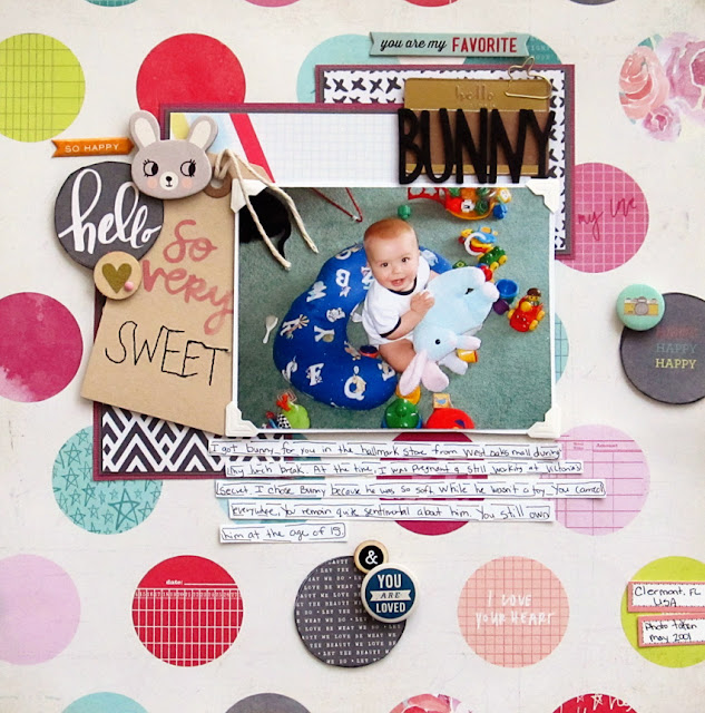
 One of the prints I struggle with the most are large polka dot patterns. If the pattern is solid (IE. all large red dots) I can sort of work with it. However, there are some sheets of patterned scrapbook paper (like the one I will be working with today) in which each dot has a different design. Such a design can be busy but there are ways to make it workable while also adding dimension.

One of the easiest ways to work with a busy patterned paper is to reduce the number of photos you are working with. While we normally like to share ideas for multiphoto page layouts here at LOAW, today I will be working with just one photo. I recommend working with two at the most for a page like this one. You don't want to cover too much of the background paper which could easily happen with a lot of photos. It's also easier to maintain a focal point for your story.


The first step in using a large polka dot print is to identify which of the dots you want to show and which ones you are ok with covering. In this case, two of the dots (what ever and But first, Glitter) don't go with the photo of my son holding a stuffed bunny. I plan to cover those by layering my photo, papers and embellishments over the top. Knowing which sections of the print will be covered will also give me an idea of where I will be placing the photo and building my design up around it.


Identify three of the polka dots that can be used to form a visual triangle around your photos and cut them out. Don't worry if one of the dots is cut off along the edge of the paper. I like to use a craft knife so that I can keep the background intact.


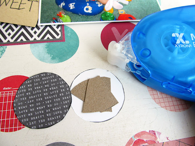
Cut pieces of scrap cardstock, add adhesive on the back side of the layout around the edges of the holes and then adhere the scrap piece of paper to the back of the layout.(Note: if you don't have a large polka dot print patterned paper, skip the first few steps.Instead, use a circle punch or hand cut circles from patterned paper scraps to make your own polka dot background on a sheet of cardstock.)


If you are concerned about unevenly cut edges, now is the time to ink the circles you cut from the background paper. Inking will help to hide any uneven cuts while also providing more definition for those particular circles. Use foam dots or layer small pieces of chipboard inside the empty circles. You are creating a platform to lift some of those dots up off the patterned paper.


It's ok to allow one or more of the dots to overlap your photo matte cluster.In fact, it makes the design more interesting.  Now that the page is complete, you can see why less photos work best on a design such as this one. To ensure the focus remained on the photo, I used a few simple pocket page cards matted with solid cardstock to create a clustered matte for the photo. You could also use scraps of paper in place of the pocket cards. Either way, choose a graphic neutral print like the graph and black and white prints shown in the layout above.

Keep embellishments to a minimum, creating a few simple clusters using the dots you chose to pop up. To help your journaling stand out, write your story on journal strips created from scrap cardstock. Outline them loosely with pen.Choose a simple, yet bold letters to help your title stand out from the page.

Popping up just a few of the polka dots helps you to create a visual triangle that will bring the focus in on your photos and your story. The raised effect creates a subtle shadowing which makes the polka dot pattern feel less flat while creating interesting dimension on your scrapbook layout.

This year, my New Year's resolution is to use more hard to use patterned papers?What your hard to use patterned paper print? Do you still find ways to use it or does it stay stuck in your stash?

Supplies Used:
Adhesive: Xyron
Craft Knife: Westcott Brand


Tuesday, December 1, 2015

Make An Ephemera Collage - Week #46

In December, we're feeling festive but don't have this year's Christmas pictures to scrap yet with all the fabulous new Christmas supplies we've gotten. Scrapbooking "Christmas past" is a great way to share some scrappy Christmas spirit while we count down the days till Santa comes!

I found these wonderful pictures of my daughter from 2008 that had somehow never been scrapped, and decided to pair them with the Dear Santa collection from the brand new company Photo Play Paper (where I am social media manager).

To make this layout quick and easy, I grabbed my copy of Scrap Free Scrapbooking by Layout-A-Week's own Jennifer Priest. The book contains cutting patterns that create multiple color blocked layouts from just a few sheets of paper, but the individual layouts can also be used stand alone. I found the perfect layout for these photos in the book's first cutting pattern set.
Scrap Free Scrapbooking cover
As I assembled the patterned paper pieces that I cut following the pattern, I inked the edges of all of the pieces except for the background. This nice gray Antique Pewter by Colorbox gave the edges a nicer definition and separated the patterns from each other a bit. Below, you can see the difference between the effect of an inked edge and a plain edge.
The next step was to build a group of embellishments in an area of white space on the left side of the photos. Since the photos were from Christmas Eve, this number 24 from one of the "Dear Santa" patterned papers was the perfect starting point.

Since I didn't have a circle die or punch the correct size, I reached for my Westcott brand microtip scissors to cut it by hand. With the small blades and the microtip, I had enough control of the scissors that you really can't tell that I cut it by hand!
From the 24 circle as a starting point, I built outward using a holiday ephemera pack by Tim Holtz to create a collage look that I was happy with in the white space next to the photos along the edge of the gray patterned block.

Minor detail...I got into it and got to a point that I was happy with it and realized that absolutely nothing on the layout was glued down yet! This meant I would have to move the ephemera to glue down the patterned paper and photos! But my iPhone came to the rescue. I snapped a quick photo of the layout built how I wanted. I then started moving things to glue them, using the photo as a reference to get them back where I wanted them.
The key to a collage like this is that while the elements look random, they really are not. The circular items are place to keep the entire thing from looking too boxy. The long red strips visually connect the collage to the two photos and provide horizontal movement to what is otherwise a vertical element. The color themes of green, red and brown repeat, along with the holly on multiple elements.

The last two items that went on to the collage are the ones at the very top of the page - the stickers that say "2008" and "Twas the night before Christmas". These elements date the layout without it having to have a formal journaling block.

While I am usually pretty adamant about including journaling blocks on my layouts, I deliberately chose to let these photos stand alone without a story attached this time. The thoughts that accompany these photos, for me, besides the context of time and place, have to do with my daughter's autism and her health issues. Sometimes, as the parent of a child with challenges, you don't want those challenges invading every memory. I decided to save those thoughts for another day/layout, and just for this layout appreciate these beautiful pictures of my daughter for what they are.
The title block was created using another piece of ephemera to ground it. The words "holiday party" serve as a subtle sub-title and as a divider between the two words. The stickers are from the "Dear Santa" collection kit, while the word "Santa" is cut on my Cricut from a piece of paper in the collection pack. Like all my other intricate die cuts, it went through my Xyron machine to be adhered easily and perfectly.
The final result, when it's all pulled together, is a quick and easy layout that I created in one sitting with only a collection pack, an ephemera pack, and a few tools. But thanks to the patterns and the collage, it looks way more complex than it really is.

This little cutie is definitely on Santa's "nice" list!
Supplies:

  • Scrap Free Scrapbooking eBook
  • Photo Play Paper "Dear Santa" collection pack
  • Tim Holtz idea-ology "Festive" ephemera pack
  • Tim Holtz idea-ology "Occasions" Small Talk stickers
  • Cricut Explore machine 
  • Teresa Collins "Santa" cut file from "December 25th" Cricut cartridge
  • Colorbox Pigment Ink in Antique Pewter
  • Xyron 505 machine
  • Westcott 5" Pink Titanium Non-stick Scissors with Microtip

Tuesday, November 24, 2015

Do your own embellishments - Week #45


Hi Ladies.. Thanksgiving is almost here and I would like to share my Thankful & Blessed Layout for this week and show you how easy is to make our own embellishments!!!
Sometimes we have a lot a papers and we realize they are so busy to use in our projects and maybe they are waiting in our stash for months and sometimes years for the perfect project....So I decided to use my old papers.. and this piece of paper is perfect for my Layout!!!


This piece of paper is so busy to use alone but I fussy cut the leaves using my marvelous Westcott scissors and they will be perfect to embellish my layout.


Did you heard about Scrap Free Scrapbooking?? Well Jennifer Priest come up with a great idea to Scrapbook Free! don't you like the idea to Scrapbook with the papers and embellishments we have and don't spend money? well she has a lot of tips and templates that she develop to scrapbook without scraps!! YES>>> No Scraps!!! yey!!!!


Using my brand NEW Trim Air - Westcott Rotary Paper Trimmer and using Scrap Free Scrapbook ideas I start cutting my paper!


Once I cut all my pieces I use my Xyron Mega Runner.. another gadget I love!


I use two pictures I don't really like to journal.. I'm more into titles and photos some times I love clean and simple and today is one of those days!


Another embellish I did was the title.. I use my electronic cutter .. you can use also dies.. the thing is we need to use what we have!!!!


This Layout is so simple but I like the results..


To finish .. I add some tags I had also from my stash and voila!! One Layout with out using anything new!! I'm so thankful and blessed to have a lot in my stash and I'm decided to use it using all the Tips from the book "Scrap Free Scrapbooking" isn't a good idea?

If you want to buy this book use code MAGDA to save $3.99 at checkout.

TUTORIAL!!


Supplies used:
Westcott Brand - Titanium Non Stick Scissors
Westcott Brand - Rotary Paper Trimmer
Westcott Brand - Self Healing Mat
Xyron Mega Runner
Silhouette Cameo Electronic Paper Trimmer
Cardstock and papers from my stash

Thanks for your sweet comments and don't forget to come next Tuesday for another Layout-A-Week!!!


Tuesday, November 17, 2015

Make the Most of Your Scrapbook Paper and Bling- Week #44

The upcoming Black Friday sales serve as a reminder for me. I have a lot of stuff in my scrapbook stash. If I see a good deal, I have a tendency to give in, especially if it is papercraft related. In years past, one of those impulse purchases involved bling. A lot of Bling...the kind that makes nice decorative 12 x 12 inch long borders. I love to use decorative jewels on my scrapbook layouts but often I find that I use them best in moderation. The long strips of bling sat unused until recently.


Chances are good that if you are hitting up sales for the best value, you are also very budget conscious when it comes to using your supplies (I know I am). Today's layout is in many ways quite minimalist.We are going to complete it with just 1 full 12 x 12 sheet of patterned paper (should be a double sided print), a scrap of patterned paper, a small bit of vellum, some bling and a few embellishments.


After selecting your photos, cut down that scrap piece of patterned paper into a square that accommodates them with a little room to add items along one side. This type of layout works well with multiple 3 x 4 inch photos or instax prints. Adhere that square scrap of paper to the B side of your 12 x 12 paper.


Carefully cut it out using a craft knife and leaving a thin edge along the side to provide a matte for your patterned paper scrap. Flip it over and adhere it so that it covers the hole.


If there are gaps (which happens to me because I cut unevenly), adhere your patterned paper block to a sheet of cardstock, leaving space for a thin edge. You can do this multiple times to add more layers if you desire. Place your photos and begin adding your embellishments. I chose to add a strip of vellum and some washi tape to visually anchor the photos onto the block.

I like bling but a full 12 x 12 inch strip is just too much for me. I often cut these longer strips apart. In this case, I cut just a few bits of these chevron bling strips to add to the layout. Long before I bought sheets of pearls and enamel dots, I would buy these strips of bling and sometimes full bling shapes on sale to cut apart for use as accents. You can easily cut a large strip or just one single jewel to use on your layouts.If the glue on the back falls off when you cut the shape or strip apart, use a tiny dot of liquid adhesive on the back of the jewel.


Add your title and then add the journaling to the scrapbook layout. I like to use journaling strips because they add an extra layer to the page while also using up scraps. The size of the title and the amount of journaling I did on this page helped me determine just how much extra embellishing I wanted to add. Both took up a lot of real estate on this page. Given that I also used quite a busy patterned paper and bright colors, I chose to keep embellishments minimal and in a fairly neutral color.

Do you love bling? Or do you prefer something less shiny on your layouts?

About this layout: We recently moved overseas to the United Arab Emirates. I wanted to document our temporary living accommodations in the hotel while also conveying how thankful I am for them.

Supplies Used: 
Patterned Paper: Bella Blvd.
Letters: Lillybee Designs
Tape: My Mind's Eye
Cork: Shimelle
Jewels: Duck Brand, Freckled Fawn
Vellum: Studio Calico

Visit me at MyScrapbookEvolution.com


Tuesday, November 3, 2015

Paper Strips For Quick & Easy Scrapbook Pages - Week #42

Halloween is over, and the candy has been eaten. Here in the U.S., that means our thoughts are now turning to turkey and stuffing!

Thanksgiving means family gatherings for most of us, which means lots of photos of course. I still have lots of photos that haven't been scrapped from when my daughter was small and the demands of motherhood limited my creative time. It's my goal to get some of these in albums! For this layout I dug out photos from her second Thanksgiving, when she was 18 months old.
We don't tend to think of our paper trimmer as a primary creative tool. Instead, we see it as a utilitarian support tool. But one of my favorite techniques for creating quick and simple pages is to use paper strips. Strips let you get a taste of a pattern without it overwhelming a page, and it also lets you add multiple colors to a page in only a small area.  This entire layout is created pretty much with only a paper trimmer. 

While the strips look random, their placement is actually very carefully determined. How do you decide where to put the strips? In this layout, the photos were placed first when planning the layout, and then the plaid and green strips were placed to ground them. then the blue strip was used to ground the title chipboard piece. 

I find that 5/8" is usually a perfect width for paper strips on most layouts, and this Westcott trimmer makes it super easy to cut them. The edge of the metal base on the right side of the blade in the photo below is 5/8". There's no squinting at small marks or measuring needed - just line your paper up with that edge and trim! 

Besides the trimmer, the only other tool that I used on this layout is a set of food planner stamps by Clearly Kelly. Many planner stamps are also perfect for pocket scrapbook and event pages. After all, if you think about it, planner stamps are designed to record in our planners the things that we are taking photos of! Their small size makes them particularly suited to using on pocket cards, like this one from the Pumpkin Spice collection kit that I added to my layout as a journaling block.

Chalk ink like this Colorbox archival one (in Chestnut Roan) gives a matte finish that is a great match to the finish on quality papers like these Simple Stories ones. Thanks to the chalk ink, the stamp looks like it is part of the original paper design.
Strips don't always have to be paper, either. At the bottom of the page I mixed in some sticker pieces to the strip design. Some word strips combined to form a longer strip underneath the "thankful" title, making the title blog a bit more bulky and inserting a few more colors into that area of the layout. Then the journaling card was grounded using a patterned border sticker that matched an element on the top of the card.
Strip layouts are extra easy to do when you start by using a coordinated collection pack. You know then that no matter what you choose from the stack, it will match. And sometimes that leads you down unexpected paths.

I used to only buy open stock paper so that I could "cherry pick" collections and only buy the sheets that I was sure that I absolutely loved. If I had done that, I would have passed by that plaid in the top strip because, well, as a child of the 70's I became somewhat traumatized by bad plaid experiences (and have the pictures to prove it) - especially brown plaid. But since it was in the collection pack, I was willing to give it a try...and I'll admit, I love the results!

If you don't have the exact elements on my supply list, you can substitute letter stickers or a die cut element for the title, and a punched or die cut element for the sticker on the top left. Get out your trimmer and start cutting!

Supplies:

  • Simple Stories Pumpkin Spice collection kit
  • Simple Stories Pumpkin Spice Chipboard
  • Simple Stories Pumpkin Spice Simple Basics paper kit
  • Colorbox Chalk Archival ink in Chestnut Roan
  • Kelly's Food Planner stamps by Clearly Kelly for Hero Arts stamps
  • Westcott Titanium Bonded 12" Multipurpose Trimmer
  • Black pen

Tuesday, October 27, 2015

Day of the Dead - Week #41


Hi Ladies!
Today I'm going to share my layout and it is all about the "Day of the Dead"  and a little of what is this Mexican holiday.

Day of the Dead or Dia de Muertos.. is a holiday we celebrate in Mexico in particular the Central and South regions.. The holiday focuses on gatherings of family and friends to pray for and remember friends and family members who have died and help the support their spiritual journey.. Traditions connected with the holiday include building private altars called "Ofrendas" honoring the deceased using sugar skulls marigolds and the favorite beverages and food of the departed, also visiting graves to be with the souls of the departed.. the intent is to encourage visits by the souls, so the souls will hear the prayers and the comments of the living directed to them.. Celebrations can take a humorous tone, as celebrants remember funny events and anecdotes about the departed.

Jose Guadalupe Posada created a famous print of a figure he called La Calavera Catrina.. as a parody of a Mexican upper-class female..

I went in 2012 to Guadalajara Mexico and as I said in central Mexico they decorate everywhere with paper mache Catrinas.. I took some pictures and some I use in my layout..


We always can use papers even if they are for a different occasions.. This paper is Christmas paper but I think it was perfect for my layout!


 This iron transfer was my inspiration for this Layout... As you know I love fussy cutting so I cut the Iron transfer with my excellent Westcott Craft Titanium non stick scissors!!! and was perfect to embellish my layout!


This is a simple-easy layout and I use 3 photos! 


The Catrina Skull is a great embellish and I add some pearls with my Pearl Pen.. 


Also I add some Molding Paste and Embossing powders from Color Box to give more color.. Day of the dead is also a lot of color!


I just did my Title with my lovely Sakura White Pen.. some flowers from my stash and ready!!! 
I hope you get some inspiration and see you next Tuesday with another fabulous Layout-A-Week!


Supplies:
Westcott Brand - Craft Titanium Scissors, Self healing cutting mat, TrimAir Trimmer
Fancy Pants "Oh Deer" Paper Collection
Crafty Chica - Day of the Dead Iron-on transfer
Pentart - Pearl Pens " Lilac, Morning Glory and Poppy
Aleen's - Turbo Tacky Glue
Color Box - Embossing Powders
Golden - Molding Paste
Sakura - White Pen


Tuesday, October 20, 2015

How to use Frames to Anchor Scrapbook Embellishments- Week #40


What is it about die cut frames that makes them so difficult to use? I usually leave them sitting untouched in my scrapbook supplies simply because I don't have the right size photo to fit inside the frame. When it comes to challenging scrapbook embellishments, you have to be willing to use them in a manner which may be quite different from their intended purpose. Today, we're going to take a look at how we can use a die cut frame to anchor a cluster of scrapbook embellishments.

Let's start by taking a look at the basic steps to creating an embellishment cluster with a frame:


 I used a large size die cut frame for my layout. Larger frames can be difficult to use simply because of their size.Cutting them down and tucking them beneath a photo adds a layer while preventing the frame's size from overpowering the other elements of your scrapbook layout. You can save the other half of the frame for another page, or tuck it in somewhere else on your layout. The large frame acts as an anchor for the embellishment cluster in that it provides a junction where it meets the heart print patterned paper matte. Placing embellishments where lines meet is a good way to create more visual interest in your page design.

 If you are have a smaller frame, you don't necessarily have to cut it in half and tuck it under. I like to layer small frames on top of photos. They act as a sort of nest for tiny embellishments.


In the video, I showed you a close up look at the wooden circle in this cluster. The circle has a wood burned phrase which simply won't work for any stories I want to tell. If you have a die cut or wood shape and don't think you can use it for your layouts, consider flipping it over so that you can use the back. They provide a nice foundation for building an embellishment cluster.

The key to a good embellishment cluster is a mixed set of scrapbook embellishments with varying weights, sizes and textures. Choose one large shape, then build it upwards with a mix of flat items like die cuts and stickers and dimensional items like buttons or flair. Choose one or two shapes or colors to repeat in at least one other cluster on the layout.

 After I filmed the video, I let the  layout sit for a bit before coming back to finish the small details. Sometimes the clusters need a little something extra to make the page feel more polished. In this case, I added some sequins. I adore sequins. They won't make your layout feel to heavy but can add a hint of glitz. 


The frame can also be a starting point from which to layer your title. Experiment with different size letter stickers. Smaller letters can be held inside the frame. Larger stickers can flow over the top of the frame, as shown above.

How do you like to use die cut frames? 


This layout was based on a design from the Scrap Free Scrapbooking E-book. You can learn more about the book at JenniferPreist.com. Use code CHRISTY to save $3.99 at checkout.

About this Layout: Flamingo Parade features photos of my son in Ardastra Gardens in Nassau, Bahamas. They have a flock of flamingos that roams free through the zoo. Once a day, they parade the flamingos through the park in the center of the zoo. Once there, guests are invited to walk out into the flock and join in.

Supplies Used:
Patterned Paper- Pink Paislee, Cocoa Daisy
Die Cuts, Wood Veneer, Stickers: Pink Paislee
Wood Buttons: Crate Paper
Sequins: My Mind's Eye
Ink: Colorbox

Visit me at MyScrapbookEvolution.com