Monday, May 30, 2016

2016 Summer Design Team Call for Layout-A-Week Blog

We are looking for scrapbookers who LOVE the craft and want to share that LOVE with others! Layout-A-Week’s goal is to inspire scrapbookers with easy-to-make layout ideas as a one stop resource for scrapbooking inspiration. Everyone can do just ONE layout a week, right?

New Term JULY 2016-FEB 2017

APPLY BY June 10, 2016!! Finalists will be notified via email after June 11, 2016.


Please apply if you:
  • Love traditional paper scrapbooking or pocket style scrapbooking
  • Have an active blog or social media presence!
  • Take great photos (and are willing to learn to improve your photos if you are not 100% there yet)
  • Love teaching others how to scrapbook!
  • Want to get FREE current scrapbooking products!
  • Enjoy writing and have a keen attention to detail
  • Want to break into the craft industry and start making your blog/craft into a business
  • Are eager to learn about SEO


Requirements:
  • Post 1 scrapbooking project per month to the Layout-A-Week blog in conjunction with challenge theme and color collage.
    • Project should be a scrapbook layout with multiple photos or a pocket style scrapbook page with multiple photos.
    • Hybrid projects are ok with at least 50% real product.
    • Must have at least 3 photos on the post. One must be a tall image 735x1100 for Pinterest and one square image 640x640 for Instagram. (we can help you with learning to make these if you don’t know how)
    • Must have a tutorial with stepped out photos (step by step) of how to make the page, start to finish. We’re looking for simple, easy to reproduce pages with 1-2 techniques that can be completed in under an hour.
    • May include your own YouTube video, embedded, with a tutorial instead of stepped out photos
    • Posts are all due on the first of the month.
    • You may use any product from any of your other teams on your posts to help promote your work with them (some limits apply - will disclose final details to team members).
    • We have a list of preferred partners we would like promoted, which we will furnish to finalists.
  • 5 of the 8 required projects during your term must use templates from the Scrap FREE Scrapbooking ebooks (or other partner products we are promoting. Details to follow).
  • Participate in 3 blog hops (with a blog post for each) during your term. This will be in addition to the 1 post per month.
  • Promote your posts with 1 link from your blog and 5 social media shares each month.


Compensation:
  • Will receive a box with product from partner companies valued at $100
  • Affiliate commissions on Hydrangea Hippo digital products
  • Gift Card bonuses for high-performance
  • Opportunity for paid campaigns through Rainmaker Media Works
  • Opportunity to participate in blog hops with partner companies
  • Free blogger training from Rainmaker Media Works
  • Promotion via social media (we’ll ask you for your handles)
  • Button to display in your side bar
  • Opportunity to promote your work via the Layout-A-Week Facebook Page using Facebook LIVE.


Other info:

  • US only due to high shipping costs and slowed shipping (stuck in customs). Wish we could accept international apps!
  • Please be sure you can commit to the 8 month term. We consider current team members in good standing FIRST for renewal and other opportunities so it pays to finish the term :)


Thank you so much for your interest in Layout-A-Week. We look forward to seeing your applications!!!

- Jennifer

Tuesday, May 17, 2016

How to Make a Fabulous Project Life Kit from Your Stash- Week #20

Every time there was a sale on Project Life Core Kits, I found myself buying one. I also picked up pocket page style cards from other resources including digital kits. It didn't take long for them to pile up. As beautiful as the cards were, I often found that many of the cards were repeated. Other times, I felt that the cards just didn't work to tell the stories I wanted to tell in my pocket pages. These frustrations led to the cards gathering dust on the shelf.

This year, I vowed to make use of the cards I already own. I have dusted them off and started giving myself freedom...freedom to create my own kits. If you find your cards are gathering dust as well, then perhaps you should join me as we make our own Project Life kits.


Step One: Pick the starting point for your kit

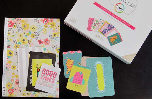
What every kit needs is a starting point.In some cases, the time of year or a set of photos may inspire the supplies you want to use. For example, if you are making pocket pages about summer activities, you would probably want warm, bright colors in your kit. Alternatively, a card pr piece of scrap paper may be your inspiration. Either way, choose a color scheme and stick to it! It's ok to go a shade up or down from the main palette but try to keep it all as close as possible. I also recommend trying to limit the palette to 5 colors or less. It will make it easier to keep a cohesive look. Let that color scheme drive your product choices.

I started with the patterned paper piece shown in the photo above. From there, I chose a Project Life kit with a similar color scheme. Not all of the colors from the core kit fit my palette, so I simply opted to discard the cards that didn't fit. I also chose a few cards from my kit club subscription.

It may be difficult to know how many cards you will need. Take a look at your photos and you will have a general idea. The great thing about making your own Project Life kit is that, should you need more supplies, you simply need to shop a bit more in your stash.


Step Two: Pick a selection of embellishments

Choose a variety of embellishments to complete your Project Life kit.Keep to the color palette, but also consider how those embellishments will contrast or compliment the cards and papers you picked. 

I chose a mix of ribbon, tape, wooden embellishments, jewels, enamel dots, rub-ons and stickers.I try to use flatter embellishments on my pocket pages since many of the pocket style page protectors are not as forgiving as a scrapbook layout page protector. This is also the opportunity for you to create some embellishments. I used my Westcott Brand craft knife to fussy cut some flowers from a scrap piece of patterned paper.

Now that your project life kit is ready, it's time for you to create with it!


Supplies Used:
Patterned Paper by Crate Paper
Pocket Page Cards from Cocoa Daisy, Becky Higgin's Project Life
Rub-Ons by Dear Lizzy
Wood Shapes by Shimelle, Dear Lizzy
Stickers by Heidi Swapp
Tape by Amy Tangerine
Craft knife by Westcott Brand


Friday, May 6, 2016

National Scrapbook Day 2016 BLOG HOP!


Happy National Scrapbook Day 2016!! Chances are, if you are reading this blog you love to scrapbook. Today, scrapbooking takes on many different forms from the traditional 12x12 layouts to smaller formats like 8.5 x 11, 6x6 and the ever growing popular pocket scrapbooking. Whichever form you prefer, we are all story tellers who love to preserve our favortie memories for generations to come. That is why I love that we take out the first Saturday each May to celebrate this wonderful hobby.

Today Nancy Nally is sharing a Star Wars inspired scrapbook page tutorial. You know, this past Wednesday was Star Wars Day - "May the 4th"! Be sure to go to the end of this blog post to see the hop list and get in on the giveaway too. 

It's Nancy, back for week #18! Wednesday was Star Wars Day - May the Fourth! - and I decided to start feeling the force here at the Layout-A-Week blog with a Star Wars layout celebrating the dark side!


This layout uses cutting pattern 6 from Jennifer Priest's fun eBook, Scrap Free Scrapbooking. These great templates let you get the most out of your paper while also fitting more photos on your layouts too! I can't stop using them!


The patterns are built on colorblocking. So the first step is to grab your trimmer (like my Westcott Titanium trimmer) and cut your paper to size for the layout's blocks. 

For this layout, black and white seemed to be the obvious color scheme to go with my Star Wars theme. I chose papers that were all black, white, or a soft gray. It is surprisingly difficult to match shades of gray. They can have very different undertones!


As I built my photo collage with my Xyron Mega Runner, I kept a couple of key things in mind to make the layout work better overall. 

First, with the characters moving left to right in the photos, it was important that the layout "read" that direction visually as well. This layout pattern was designed that direction, but if it hadn't been, I could have reversed it to be in harmony with my photos. 

Second I positioned my photos very deliberately. I knew that part of the photo in the bottom left of the collage would be covered up. So placing the Darth Vader photo there meant that I would lost part of his flowing cape, not a huge problem for the image. 

Leaving the upper right corner empty was also deliberate, as you'll see below! 


To fill that upper right corner, I cut a 3" circle from white cardstock, and stamped it with a graph stamp and gray ink. I purposely didn't worry about getting the impression perfect. 

Next, I used the Large Canvas Stripes stamp I only inked the very last stripe on the edge. First I stamped it twice side by side in light gray (Pewter) across the circle's center. Then I repeated it with the darker gray (Charcoal) pad, but with this color I stamped the stamp on scrap paper first and then used the 2nd impression to stamp on my embellishment.

The next step is to use the Tile Texture stencil and brush Charcoal ink through it with a Colorbox Stylus. After doing that in selected areas, move the stencil a fraction of an inch to the right or left and ink the same areas again. 

After the inking is done, punch a 1" hole in upper left quadrant of the circle. Back the circle with light gray cardstock, and stamp dark gray in the center of it. 


The finished product is a Death Star to hover ominously over your Dark Side characters! Paired with some journaling strips created with a labelmaker, it fills the top corner of the layout nicely. The journaling strips bring some of the black from the bottom title up to the top of the layout, as well as adding some of the retro feel of the Star Wars aesthetic. 


The final touch is to add a title cut on my Cricut machine using a Star Wars styled font that I downloaded from the internet. A well styled title can add a lot of theme to a layout. The Star Wars font style is so distinctive! 


 Supplies:
  • Scrap FREE Scrapbooking ebook
  • Pink Paislee "Memorandum" Patterned Paper Pad
  • Pink Paislee "C'est La Vie" collection - Paper 10
  • Black textured cardstock
  • White smooth cardstock
  • Grey textured cardstock
  • Cricut Explore Machine
  • Font: Star Jedi (downloaded from internet)
  • EK Success Circle Punch - 1"
  • Colorbox Mix'd Media Inx in Pewter
  • Colorbox Chalk Ink pad - Charcoal
  • Colorbox Stylus
  • Dymo Organizer Xpress Labelmaker
  • Xyron 150 sticker maker
  • Hero Arts Clearly Kelly stamps - Kelly's Outline Alphabet
  • Hero Arts background stamps - Graph Background & Large Canvas Stripes
  • The Crafter's Workshop stencil - Mini Tile Texture
Have you created Star Wars or other sci-fi themed icons yourself for your layouts? Let us know in the comments!!

Now it's time to continue on our hop AND enter our amazing National Scrapbook Day giveaway!!!


 I'm giving away over $100 worth of scrapbooking supplies!!
  • Sizzix Dies!
  • NEW Sizzix Paper Pad
  • Sizzix Stamps!
  • Amy Tangerine Notebook
  • Ali Edwards Notecards from CHA
  • Sticker Masks from STICKO
  • Neutrogena GO bag!
  • Premiere Yarns Downtown Abbey Sampler
  • Pentart Pearl Pens x 3
  • Coloring Book Book Marks
  • Coloring Book Notebook
  • Elizabeth Craft Designs Coffee Mug with tiny spoon
  • RUKristin Papercrafts Stamps and Journaling Cards
  • Adornit Tote
  • Adornit Coloring Planner Binder with Pages
  • Adornit Washi Tape - 3 rolls!
  • Scrapbook Adhesives by 3L Adhesive PACKS
  • Tombow Dual Brush Pens SET
  • ThermOWeb DecoFoils and Accessories
  • Clearsnap Glue Gloss
  • Richard Garay Tote
  • and more!
Use the links at the end of this post to enter to win and be sure to visit all of the blogs on the hop.

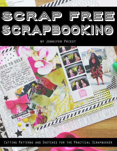
  ScrapFree-Scrapbooking-Cover 

AND be sure to check out the Scrap FREE Scrapbooking ebook that has templates and sketches to create over 50 scrapbook pages with NO SCRAPS leftover. NO SCRAPS!!  CLICK HERE for more info...

Continue on the hop:

Hydrangea Hippo 
They Call Me Tatar Salad 
Layout-A-Week YOU ARE HERE
My Time To Play   GO HERE NEXT
My Scrapbook Evolution 
Just JP 
Smiling Colors 
My Creative Life 
Pink Zebra Paper Creations 
Scraps of Reflection 
Lynda Creates 

GIVEAWAY - enter here:
a Rafflecopter giveaway