Showing posts with label Christy Strickler. Show all posts

Tuesday, June 28, 2016

How to Make Simple DIY String Art Embellishments- Week #25


This summer, I keep seeing string art popping up everywhere. It's fun to make and gives your home an instant cozy, handmade with love feel. String art is also something that's easy to create in scrapbook embellishment form. More than likely, you have all of the supplies on hand which makes this a budget friendly way to join in on the trend. The basic supplies consist of a permanent marker, chipboard shape, adhesive and string.


Step One: Choose the chipboard shape for your string art.

I chose to use these chipboard cats from Totem Poppets, but any chipboard shape will do. You will need to decide a base color for the chipboard. I chose black and used a permanent marker to color the chipboard pieces. You could easily use ink or paint as well and choose any color you wish.


Step Two: Add a strip of adhesive to the back of the chipboard.

A tape runner seems to work best. Double sided tape would also be a good choice. Run a small line of the adhesive down the center of the chipboard piece. As you wind the string, it will stick to the adhesive and not slip off. 


Step Three: Wind the String around the Chipboard Piece.

You may need to add more adhesive as you work. Using 2-3 strands of string, wrap it around the shape at uneven intervals until you are happy with the way it looks. I chose three colors of string to make the piece a little more interesting. 


It does help to have a prior idea of where your string art piece is going to be placed on the finished layout. It isn't a heavy or bulky embellishment, but it may be large depending on the size of the chipboard piece you chose. I love that each piece is unique and that they are easy to make. It took me about 10-15 minutes from start to finish to create this cat embellishment. You can easily adapt this technique for any chipboard shape. Consider refreshing older chipboard letters in your supplies.

Have you tried string art? Share links to your string art creations in the comments for this blog post.

Supplies Used:
Xyron Adhesive
Embroidery Floss
Permanent Marker
Patterned Paper by LilyBee Designs
Flowers by Recollections
Stickers by Evalicious
Letters by Basic Grey and American Crafts


Tuesday, May 17, 2016

How to Make a Fabulous Project Life Kit from Your Stash- Week #20

Every time there was a sale on Project Life Core Kits, I found myself buying one. I also picked up pocket page style cards from other resources including digital kits. It didn't take long for them to pile up. As beautiful as the cards were, I often found that many of the cards were repeated. Other times, I felt that the cards just didn't work to tell the stories I wanted to tell in my pocket pages. These frustrations led to the cards gathering dust on the shelf.

This year, I vowed to make use of the cards I already own. I have dusted them off and started giving myself freedom...freedom to create my own kits. If you find your cards are gathering dust as well, then perhaps you should join me as we make our own Project Life kits.


Step One: Pick the starting point for your kit

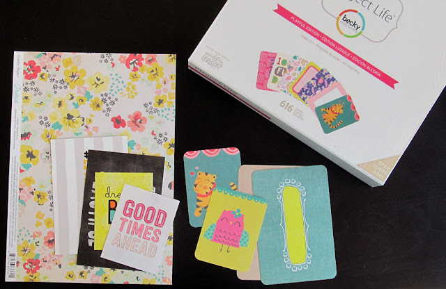
What every kit needs is a starting point.In some cases, the time of year or a set of photos may inspire the supplies you want to use. For example, if you are making pocket pages about summer activities, you would probably want warm, bright colors in your kit. Alternatively, a card pr piece of scrap paper may be your inspiration. Either way, choose a color scheme and stick to it! It's ok to go a shade up or down from the main palette but try to keep it all as close as possible. I also recommend trying to limit the palette to 5 colors or less. It will make it easier to keep a cohesive look. Let that color scheme drive your product choices.

I started with the patterned paper piece shown in the photo above. From there, I chose a Project Life kit with a similar color scheme. Not all of the colors from the core kit fit my palette, so I simply opted to discard the cards that didn't fit. I also chose a few cards from my kit club subscription.

It may be difficult to know how many cards you will need. Take a look at your photos and you will have a general idea. The great thing about making your own Project Life kit is that, should you need more supplies, you simply need to shop a bit more in your stash.


Step Two: Pick a selection of embellishments

Choose a variety of embellishments to complete your Project Life kit.Keep to the color palette, but also consider how those embellishments will contrast or compliment the cards and papers you picked. 

I chose a mix of ribbon, tape, wooden embellishments, jewels, enamel dots, rub-ons and stickers.I try to use flatter embellishments on my pocket pages since many of the pocket style page protectors are not as forgiving as a scrapbook layout page protector. This is also the opportunity for you to create some embellishments. I used my Westcott Brand craft knife to fussy cut some flowers from a scrap piece of patterned paper.

Now that your project life kit is ready, it's time for you to create with it!


Supplies Used:
Patterned Paper by Crate Paper
Pocket Page Cards from Cocoa Daisy, Becky Higgin's Project Life
Rub-Ons by Dear Lizzy
Wood Shapes by Shimelle, Dear Lizzy
Stickers by Heidi Swapp
Tape by Amy Tangerine
Craft knife by Westcott Brand


Tuesday, April 19, 2016

How to Create a Vellum Frame to Highlight your Focal Point-Week #16


 I can remember when sheets of simple white vellum were the rage. I would buy them in packs or small booklets, eager to use the sheets as journal strips or to embellish a scrapbook layout.  Now I see it appearing as die cuts, tags, or gold foiled sheets.I am tempted to buy some of the new things but I still have a full book of that white vellum hanging out in my supplies. Since vellum is making a reappearance on the trend scene, I think it's time we put it to use. You can easily use it to highlight your focal photo, creating what is essentially a simple vellum frame.

First, you will need to choose the right photo. Look for one that has your subject in the center but might not be the very best picture you have. A lot of empty space in the picture works well. You might be asking why you wouldn't just crop the empty space out of the picture. Sometimes that empty space provides context for the story. For example,I chose photos of my son at a co-workers wedding. He was one of just a few kids( the youngest there) and when it was time for the kids dance, he was pretty much alone on the dance floor. I wanted to show that he was all by himself, but I also didn't want him to get lost within the photo. It's not a great picture of him either. The lighting was horrible. I did play around with cropping the photo, but I found it made it blurry. I printed the photo at an almost 5x7 size.It was the largest I could go with the original picture without losing picture quality. Using the vellum frame allows me to make him the focal point of the picture. The background is still there, but just not as noticeable. Print any support photos in a smaller size.


Once you have chosen the picture, cut the vellum down to a size that covers it completely. DON"T adhere is to the photo just yet. Determine what shape you want the frame to be. I chose a circle, but you could easily use a square, hexagon or other shape. Use a template or draw the shape free hand. Make sure not to bear down heavily on the pencil. Lighter lines are easier to erase.


Use a craft knife to cut the shape out of the vellum. Erase any stray pencil lines, then adhere the vellum to the picture. I used a xyron tape runner, but only placed small sections of adhesive in the corners. I did not press down heavily. My goal was for the adhesive not to show, but if it did,I could cover those spots with the title and embellishments.


You can leave the frame as is, or embellish a little. I chose to add some hand stitching around the circle. You could also outline the frame with a pen. Finish the layout by adding your title, embellishments and journaling.

Do you have a big stash of vellum hidden somewhere? Or have you come up with some unique ways to use it up? Share your vellum tips in the comments.

Supplies Used:
Xyron Adhesive
Craft Knife by Westcott Brand
Paper by Cocoa Daisy
Letters by Jillibean Soup and American Crafts
Die Cuts by Pink Paislee and Fancy Pants


Tuesday, February 16, 2016

7 tips for Magnificent Monochromatic Scrapbook Layouts- week #7


Valentine's day is over and the focus seems to be shifting from love to luck. The pinks and reds often associated with the holiday will soon be giving way to shades of spring color. Most notably, March seems to be filled with lots of green. St, Patrick's day is associated with both green and gold, so it always seems appropriate to choose it as the main color when I scrapbook March photos. This time around, I decided to challenge myself to create a monochromatic layout using green.

A monochromatic layout can definitely have a lot of impact. Color is a unique tool that can set tone for the page.Creating a layout with one predominant color can help you put the focus on your photos and story. It can also become a muddled mess. I have a few tips for how you can successfully pull off a magnificent monochromatic scrapbook layout.

Tips for Creating a Monochromatic Scrapbook Layout

1.Outline patterned papers or matte them to help keep the page from becoming too busy. Use ink or a marker to edge the papers. Or, as in the layout above, matte them with a piece of cardstock. I chose a cardstock matte in a shade of green just a bit darker than the base cardstock and the color in the patterned papers. You may also wish to matte your photos. The mattes or inked edges will help provide a subtle delineation between each layer of color.

2. Sometimes it is best to use a grid style design. If you find that you are losing the photos in a layer of patterned paper or if the design becomes to busy, fall back to using a grid design. The grid can be a little loose with the embellishments flowing outside of the boundaries.

3. Try to vary your patterns a bit or choose just one patterned paper print. I used a stripe, polka dot, geometric and hounds tooth print on my page. I could have also chosen just one print and filled a grid with it. Essentially, I am recommending you choose a set number of prints and stick with it. Pay attention the weight or scale of each patterned paper. If you are choosing 2 or more prints, you don't want them all to be the same size design.


4.Use texture. Texture adds support for your story. Felt is soft and gives a sense of warmth. Lace is soft. Choose the right textures to set the mood for the page and to add visual interest.

5. Clearly define your focal point. I want to make sure my pictures don't get lost in a sea of green. I strategically placed 3 doilies to create a visual triangle around my photos.


6. It's ok to add a neutral color. Green is the predominant color on my scrapbook layout. I also used white and gold on the page to give the eyes a little break from all of that green.

7. Don't use just one shade of your chosen color. It is a lot more visually interesting to see all of the colors of green on the layout. Additionally, it would be difficult for me to find all of the same colors of green in my supplies. Don't stress about keeping things exact. Look more for motif, texture or pattern that might better contribute to the story.


Creating a monochromatic layout is a great way to use up supplies. You can easily make a kit by just choosing that single color from your stash of supplies. If you were to make a monochromatic scrapbook layout, what color would you choose?


Supplies Used:
Xyron Adhesive
Bazzill Cardstock
Sutdio Calico and Basic Grey Papers
Felt by Bella Blvd.
German Foil
Letters by American Crafts, Sassafrass and Basic Grey
Tag by PinkFresh Studio


Tuesday, January 19, 2016

How to Create an Embellishment Cluster with Die Cuts- Week #3


When I bought paper, I used to buy every embellishment that matched it: die cuts, stickers,chipboard and whatever else I could get my hands on. I would then use the package of die cuts sparingly. I wanted needed those die cuts to last. I felt like it would be a shame to run out of them and still have paper left in a collection.I would see people on design teams and think they were crazy for piling on a ton of embellishments from one package.

Over time( I have been scrapbooking since 2001), my paper and embellishment collection grew. Many of the die cuts and embellishments sat unused. I realized that my style reflected a frugal blend of simple yet layered. I used up paper but was left with a large supply of die cuts. Holding all those packages of die cuts in my hands, I realized that I had to find a way to use them. I started layering them into embellishment clusters.

The layout I am sharing today features die cut vellum pieces. It would be easy to substitute punched patterned paper shapes or even stickers. Feel free to mix both die cuts and stickers into the same cluster.


Key Points to Consider when Layering Die Cuts into Embellishment Clusters

  • Choose a background paper which contrasts with the die cuts. I had a lot of bright colored hearts, so I chose a white sheet of cardstock.
  • The cluster don't have to be horizontal as in the layout shown above. Choose your photo arrangement first, then push the die cuts around until you have them positioned to your liking.
  • Using three clusters gives you a visual triangle. Try to arrange the clusters to form the triangle around your focal point photo. In the layout above, the focal point is the large photo with the closeup of my cat,
  • Focus on 1-3 concepts to create the visual triangle. I used die cuts of all the same shape in each cluster. Colors are repeated. I also placed the text near each cluster. You can have more than one visual triangle on your page.
Normally, I am not an advocate of piling embellishments onto a single layout. However, if you are sitting on packages of die cuts in your stash, I think it's fine to give yourself permission to add quite a few to a single page. After all, the supplies are there to be used.Focus on keeping the page simple. Choose a neutral background and add heavier embellishments like chipboard or flowers to each die cut cluster sparingly.

Supplies Used:
Xyron Adhesive
Tape: My Mind's Eye, Amy Tangerine
Letters: Duct Tape Brand, Basic Grey
Felt: Sassafrass, Bella Blvd.
Die Cuts: Studio Calico
Chipboard: Totem Poppets
Jewels: Imaginesce
Metal: Maya Road


Tuesday, December 15, 2015

A New Year's Resolution and Hard to Use Patterned Paper- Week #48

It's no secret that I love patterned paper. Most scrapbookers do. Certain patterns just fall right in with my style. Other just don't which means they have a tendency to sit in my stash. It's not that I hate those patterns. What is far more likely is that they may be hard to work with. Often there are parts of the design I don't want to cover up and I am unsure that cutting the sheet apart is the best answer.


 One of the prints I struggle with the most are large polka dot patterns. If the pattern is solid (IE. all large red dots) I can sort of work with it. However, there are some sheets of patterned scrapbook paper (like the one I will be working with today) in which each dot has a different design. Such a design can be busy but there are ways to make it workable while also adding dimension.

One of the easiest ways to work with a busy patterned paper is to reduce the number of photos you are working with. While we normally like to share ideas for multiphoto page layouts here at LOAW, today I will be working with just one photo. I recommend working with two at the most for a page like this one. You don't want to cover too much of the background paper which could easily happen with a lot of photos. It's also easier to maintain a focal point for your story.


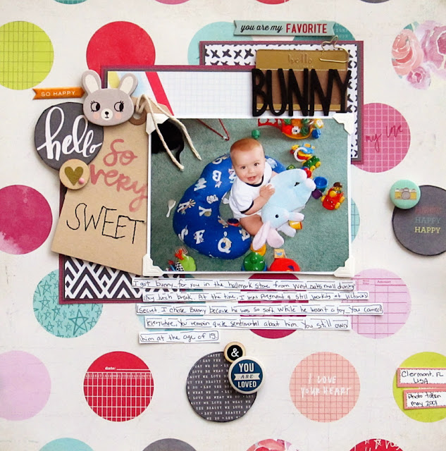
The first step in using a large polka dot print is to identify which of the dots you want to show and which ones you are ok with covering. In this case, two of the dots (what ever and But first, Glitter) don't go with the photo of my son holding a stuffed bunny. I plan to cover those by layering my photo, papers and embellishments over the top. Knowing which sections of the print will be covered will also give me an idea of where I will be placing the photo and building my design up around it.


Identify three of the polka dots that can be used to form a visual triangle around your photos and cut them out. Don't worry if one of the dots is cut off along the edge of the paper. I like to use a craft knife so that I can keep the background intact.


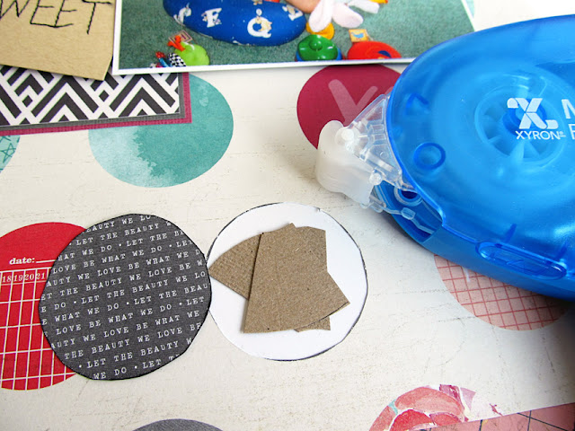
Cut pieces of scrap cardstock, add adhesive on the back side of the layout around the edges of the holes and then adhere the scrap piece of paper to the back of the layout.(Note: if you don't have a large polka dot print patterned paper, skip the first few steps.Instead, use a circle punch or hand cut circles from patterned paper scraps to make your own polka dot background on a sheet of cardstock.)


If you are concerned about unevenly cut edges, now is the time to ink the circles you cut from the background paper. Inking will help to hide any uneven cuts while also providing more definition for those particular circles. Use foam dots or layer small pieces of chipboard inside the empty circles. You are creating a platform to lift some of those dots up off the patterned paper.


It's ok to allow one or more of the dots to overlap your photo matte cluster.In fact, it makes the design more interesting.  Now that the page is complete, you can see why less photos work best on a design such as this one. To ensure the focus remained on the photo, I used a few simple pocket page cards matted with solid cardstock to create a clustered matte for the photo. You could also use scraps of paper in place of the pocket cards. Either way, choose a graphic neutral print like the graph and black and white prints shown in the layout above.

Keep embellishments to a minimum, creating a few simple clusters using the dots you chose to pop up. To help your journaling stand out, write your story on journal strips created from scrap cardstock. Outline them loosely with pen.Choose a simple, yet bold letters to help your title stand out from the page.

Popping up just a few of the polka dots helps you to create a visual triangle that will bring the focus in on your photos and your story. The raised effect creates a subtle shadowing which makes the polka dot pattern feel less flat while creating interesting dimension on your scrapbook layout.

This year, my New Year's resolution is to use more hard to use patterned papers?What your hard to use patterned paper print? Do you still find ways to use it or does it stay stuck in your stash?

Supplies Used:
Adhesive: Xyron
Craft Knife: Westcott Brand


Tuesday, November 17, 2015

Make the Most of Your Scrapbook Paper and Bling- Week #44

The upcoming Black Friday sales serve as a reminder for me. I have a lot of stuff in my scrapbook stash. If I see a good deal, I have a tendency to give in, especially if it is papercraft related. In years past, one of those impulse purchases involved bling. A lot of Bling...the kind that makes nice decorative 12 x 12 inch long borders. I love to use decorative jewels on my scrapbook layouts but often I find that I use them best in moderation. The long strips of bling sat unused until recently.


Chances are good that if you are hitting up sales for the best value, you are also very budget conscious when it comes to using your supplies (I know I am). Today's layout is in many ways quite minimalist.We are going to complete it with just 1 full 12 x 12 sheet of patterned paper (should be a double sided print), a scrap of patterned paper, a small bit of vellum, some bling and a few embellishments.


After selecting your photos, cut down that scrap piece of patterned paper into a square that accommodates them with a little room to add items along one side. This type of layout works well with multiple 3 x 4 inch photos or instax prints. Adhere that square scrap of paper to the B side of your 12 x 12 paper.


Carefully cut it out using a craft knife and leaving a thin edge along the side to provide a matte for your patterned paper scrap. Flip it over and adhere it so that it covers the hole.


If there are gaps (which happens to me because I cut unevenly), adhere your patterned paper block to a sheet of cardstock, leaving space for a thin edge. You can do this multiple times to add more layers if you desire. Place your photos and begin adding your embellishments. I chose to add a strip of vellum and some washi tape to visually anchor the photos onto the block.

I like bling but a full 12 x 12 inch strip is just too much for me. I often cut these longer strips apart. In this case, I cut just a few bits of these chevron bling strips to add to the layout. Long before I bought sheets of pearls and enamel dots, I would buy these strips of bling and sometimes full bling shapes on sale to cut apart for use as accents. You can easily cut a large strip or just one single jewel to use on your layouts.If the glue on the back falls off when you cut the shape or strip apart, use a tiny dot of liquid adhesive on the back of the jewel.


Add your title and then add the journaling to the scrapbook layout. I like to use journaling strips because they add an extra layer to the page while also using up scraps. The size of the title and the amount of journaling I did on this page helped me determine just how much extra embellishing I wanted to add. Both took up a lot of real estate on this page. Given that I also used quite a busy patterned paper and bright colors, I chose to keep embellishments minimal and in a fairly neutral color.

Do you love bling? Or do you prefer something less shiny on your layouts?

About this layout: We recently moved overseas to the United Arab Emirates. I wanted to document our temporary living accommodations in the hotel while also conveying how thankful I am for them.

Supplies Used: 
Patterned Paper: Bella Blvd.
Letters: Lillybee Designs
Tape: My Mind's Eye
Cork: Shimelle
Jewels: Duck Brand, Freckled Fawn
Vellum: Studio Calico

Visit me at MyScrapbookEvolution.com


Tuesday, October 20, 2015

How to use Frames to Anchor Scrapbook Embellishments- Week #40


What is it about die cut frames that makes them so difficult to use? I usually leave them sitting untouched in my scrapbook supplies simply because I don't have the right size photo to fit inside the frame. When it comes to challenging scrapbook embellishments, you have to be willing to use them in a manner which may be quite different from their intended purpose. Today, we're going to take a look at how we can use a die cut frame to anchor a cluster of scrapbook embellishments.

Let's start by taking a look at the basic steps to creating an embellishment cluster with a frame:


 I used a large size die cut frame for my layout. Larger frames can be difficult to use simply because of their size.Cutting them down and tucking them beneath a photo adds a layer while preventing the frame's size from overpowering the other elements of your scrapbook layout. You can save the other half of the frame for another page, or tuck it in somewhere else on your layout. The large frame acts as an anchor for the embellishment cluster in that it provides a junction where it meets the heart print patterned paper matte. Placing embellishments where lines meet is a good way to create more visual interest in your page design.

 If you are have a smaller frame, you don't necessarily have to cut it in half and tuck it under. I like to layer small frames on top of photos. They act as a sort of nest for tiny embellishments.


In the video, I showed you a close up look at the wooden circle in this cluster. The circle has a wood burned phrase which simply won't work for any stories I want to tell. If you have a die cut or wood shape and don't think you can use it for your layouts, consider flipping it over so that you can use the back. They provide a nice foundation for building an embellishment cluster.

The key to a good embellishment cluster is a mixed set of scrapbook embellishments with varying weights, sizes and textures. Choose one large shape, then build it upwards with a mix of flat items like die cuts and stickers and dimensional items like buttons or flair. Choose one or two shapes or colors to repeat in at least one other cluster on the layout.

 After I filmed the video, I let the  layout sit for a bit before coming back to finish the small details. Sometimes the clusters need a little something extra to make the page feel more polished. In this case, I added some sequins. I adore sequins. They won't make your layout feel to heavy but can add a hint of glitz. 


The frame can also be a starting point from which to layer your title. Experiment with different size letter stickers. Smaller letters can be held inside the frame. Larger stickers can flow over the top of the frame, as shown above.

How do you like to use die cut frames? 


This layout was based on a design from the Scrap Free Scrapbooking E-book. You can learn more about the book at JenniferPreist.com. Use code CHRISTY to save $3.99 at checkout.

About this Layout: Flamingo Parade features photos of my son in Ardastra Gardens in Nassau, Bahamas. They have a flock of flamingos that roams free through the zoo. Once a day, they parade the flamingos through the park in the center of the zoo. Once there, guests are invited to walk out into the flock and join in.

Supplies Used:
Patterned Paper- Pink Paislee, Cocoa Daisy
Die Cuts, Wood Veneer, Stickers: Pink Paislee
Wood Buttons: Crate Paper
Sequins: My Mind's Eye
Ink: Colorbox

Visit me at MyScrapbookEvolution.com