Tuesday, January 12, 2016
2016 - Week #2
Hello and Happy 2016 to you and your family. I hope everyone is having a great start to the new year.
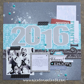
Today I wanted to share a layout with you that is representing my new year.
I started with a photo of my family. My husband and my three kiddos. My printer was running low on colored ink so I printed it it black and white. I made it a square because I just liked it that way. A little different from a traditional 4x6. So then I went to my scrap closet and stood there looking at my paper collection. I haven't bought new scrapbook paper in a long time, but I need to get moving on using it up too before I then decide I don't like the paper anymore and need to get rid of it all and buy new stuff lol.
So I pulled out some stuff and sat down at my desk. I knew already that I wanted to turquoise and grey colors on my layout but some of the other stuff I had pulled out for the background just weren't making me jump up and down. So I grabbed this dark grey textured cadstock, which I loved the best so far. But there was just something still I thought it needed.
So I spritzed it a few times with some white craft spray and made sure it got a few big globs and set it aside to dry.
While it was drying I decided that my layout would just be those exact colors, the turquoise and greys. I dug through all my stash drawers and found coordinating papers and embelishments.
I knew I had to use the turqouise patterened paper with the cameras on it. It was meant to be since the picture of us was my actually taking a "selfie" of us. So then I found the small strip I had of the cursive black and white alphabet. So I knew that the black and white would go perfect with the color theme I already had going on. And it was just a scrap piece and already cut down to a great size.
I wanted my focus to be on my title (besides the photo) so I wanted it to be large. I also wanted it to really stand out, so I framed the 2016 in a thin border. I cut the border out in white and the actual numbers I cut in a silver metallic cardstock. I used the Xyron Creative Station to adhere those to my page.
What I like to do for my layouts is start with the basics. I cut just a thick strip of the camera paper and attached it to the grey cardstock. Then I attached the alphabet paper just below it. I knew that is where I wanted my photo, so I laid it there but didn't attach it just in case I wanted to move it around just a bit.
So once I start with those basics then I go through my drawers to find matching things that I can add to my layout. The tag to the right that said twenty in the exact right colors was perfect, except it said thirteen on it. So to solve that I just trimmed off the word thirteen and added some silver numbers at the end to make it a perfect fit for my layout.
I found a pocket card that said make a wish, which I thought was perfect for a layout about the New Year. I found the Arizona tag, and although it does not match my layout, it has meaning to my family. We just moved to Arizona 5 months ago and we are starting the new year here. So I like the small pop of color it gives and also what it represents to our family.
I instantly fell in love with the glittery silver frame and decided to frame my journaling inside there. I found some tags that matched and of course some washi tape. I glued everything down and then added some extra little enamel dots and silver heart stickers to complete my page.
I think the layout really represents so much about our family with the color theme, the Arizona tag, our photo (which we are all wearing our Miami Dolphins gear), and a bit of sparkle too.
I hope you enjoy and I am looking forward to sharing more layouts with you this year.


No comments:
Post a Comment
Leave us some scrappy love!